The Importance of Quality Control in Printing
Quality control in printing is not a last-minute inspection. It is the system that keeps expensive surprises from reaching the press sheet, the bindery table, or the customer’s hands.
Most buyers, designers, and production teams come to this topic with the same practical questions:
- Why do some print jobs look sharp and stable on the proof but drift during the run?
- Which defects should be caught in prepress, and which must be monitored on press?
- How do teams measure quality without reducing every decision to guesswork?
- What habits separate a reliable print workflow from one that keeps repeating the same errors?
“Printing should be invisible.”
Beatrice Warde
That line still holds up because the best print work does not call attention to preventable defects. It supports the message, the brand, and the function of the piece. Organizations such as PRINTING United Alliance’s G7 program and Fogra’s digital print certifications both point in the same direction: predictable quality comes from standardization, measurement, and repeatable process control rather than good intentions alone.
In this article, I will walk through the practical baseline: what quality control means in a printing environment, the most common failure modes, the checks that matter most, and two real-world examples that show why disciplined controls protect schedule, cost, and brand trust at the same time.
Overview of Quality Control in Printing
Quality control in printing is the structured process of preventing, detecting, and correcting defects from the first file review through the final packed piece. That matters because a print job has several points where it can go wrong: file setup, color conversion, substrate choice, registration, drying or curing, trimming, folding, binding, packing, and repeat-order consistency. If those controls exist only at the end of the job, the most expensive errors have already happened.
A stable print workflow usually works in layers. Prepress verifies that the file is technically safe. Proofing checks whether the intended visual result is realistic. Press-side checks track whether the run is staying within acceptable tolerance. Finishing inspection confirms that die-cuts, folds, laminates, and trims still match the approved standard. A final review documents what should be repeated and what should not be repeated next time. None of this is glamorous. It is, however, cheaper than reruns.
For a business producing packaging, promotional pieces, folders, or branded collateral, quality control also protects credibility. A carton that shifts off-brand in color, a folder that cracks on the fold, or a brochure with uneven trimming sends a message the client did not intend to send. The product may still function, but the presentation has already absorbed damage.
That is why I treat print quality as an operational discipline rather than a decorative concern. The minimum safe setup is simple: define the target, measure against it, stop drift early, and document the recovery path when something moves out of tolerance. Teams that do this consistently waste less time arguing about whether a defect is “noticeable.” The standard already answers that question.
If you are comparing print support options for packaging and branded materials, the Services page outlines how Troserma approaches material choice, finish selection, and production planning before a job gets expensive.
Useful Terms and Definitions
Quality conversations improve quickly when everyone is using the same vocabulary. A few basic terms prevent avoidable confusion between designers, buyers, and press operators.
- Preflight is the technical review of the production file before output. It catches missing fonts, low-resolution images, incorrect bleed, wrong color spaces, and similar setup problems.
- Proof is the approved reference used to judge the intended outcome. Depending on the workflow, this may be a soft proof, contract proof, or press proof.
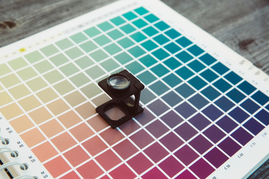
- Registration describes how accurately the different color separations align. Poor registration creates blurry edges, halos, and text that looks slightly doubled.
- Delta E is a numerical expression of color difference. PrintWiki’s Delta E overview is a useful refresher because it explains why color control depends on measurable difference instead of subjective description alone.
- Gray balance is the relationship of process inks used to create neutral gray. When gray balance drifts, the full image can start to look warm, cool, muddy, or unstable even if solid colors appear close.
- Makeready is the setup phase before a press reaches production conditions. Weak setup discipline tends to show up later as waste, delay, and inconsistent first sheets.
- Set-off happens when wet ink transfers from one printed surface to another during stacking. It can turn a clean run into a cleanup exercise very quickly.
Definitions matter because quality failures are often communication failures first. If the designer is speaking about visual intent, the estimator is speaking about substrate limitations, and the press crew is speaking about production tolerances, they can all be technically correct while still moving toward the wrong result.
Common Quality Issues in Printing
Most print defects are familiar, which is useful. Repetition makes them easier to anticipate if the workflow is disciplined enough to look for them at the right stage.
| Issue | How it shows up | Typical cause | Operational consequence |
|---|---|---|---|
| Color drift | The run starts strong, then gradually shifts warmer, cooler, lighter, or duller. | Weak calibration, unstable ink-water balance, substrate variation, or inconsistent digital profiling. | Repeat orders no longer match and brand colors lose credibility. |
| Misregistration | Fine text, rules, or edges look fuzzy or doubled. | Mechanical movement, poor setup, or plate and substrate instability. | Sharpness drops and small type becomes risky. |
| Banding or mottling | Flat tints look streaky or uneven instead of smooth. | Ink delivery inconsistency, imaging issues, or unsuitable screening for the substrate. | Large background areas look cheap even when artwork is good. |
| Scuffing and abrasion | Printed surfaces mark during handling, packing, or transit. | Insufficient curing, weak coating choice, or unrealistic handling expectations. | Finished pieces arrive looking used instead of new. |
| Trim or fold error | Panels land unevenly, copy crowds the edge, or folds crack. | Incorrect imposition, poor grain direction planning, or finishing drift. | The job may function, but it no longer feels precise. |
| Contamination and marking | Dust, hickeys, scratches, fingerprints, or random surface defects appear. | Weak housekeeping, rushed handling, or worn consumables. | Inspection time increases and defect sorting becomes manual labor. |
Color drift is usually the most sensitive issue because it can move slowly enough to avoid panic while still ruining consistency across the run. That is especially dangerous in packaging and promotional work, where the piece often has to match earlier campaigns, shelf standards, or multiple production lots.
Registration errors are less subtle. Small text and logos reveal them immediately. A slight shift may pass on a poster viewed from a distance, but it becomes obvious on folders, cartons, labels, and premium collateral where the audience handles the piece at close range.
Finishing-related defects tend to create the harshest conversations because they arrive after most of the production cost has already been spent. If a fold cracks, a laminate peels, or a die-cut drifts, there is rarely a cheap correction path. By that stage, the job is asking for salvage decisions instead of clean process control.
Techniques for Ensuring Quality
Strong quality control is built from repeatable checks, not heroic saves. The goal is to catch the error at the cheapest stage available.
1. Standardize prepress before the file reaches the press
The first control point is the file itself. Bleed, safe area, image resolution, overprint settings, embedded fonts, transparency handling, and color space choices should all be checked before output. A job that begins with unresolved file risk usually becomes a more expensive problem later, because the press team is then trying to solve a design or setup issue under schedule pressure.
A dependable prepress checklist often includes:
- Final trim size, bleed, and live area confirmed.
- Images at appropriate resolution for the print process and viewing distance.
- Color builds and spot colors documented.
- Black text and fine rules reviewed for reliable reproduction.
- Finishing marks, folds, and glue areas checked against the structural plan.
- Approved proof attached to the job ticket so the reference does not change midstream.
Prepress is where preventable ambiguity should die. If the job ticket, file, and proof disagree, the press run inherits a conflict it did not create.
2. Use measurable color targets instead of visual memory
Color memory is unreliable. People are far better at noticing that something changed than at recalling precisely what the correct version looked like. That is why production teams rely on measurable targets, calibration routines, and controlled proofs rather than memory alone.
The practical lesson from industry standards is consistent: shared targets reduce argument and waste. PRINTING United Alliance’s G7 framework focuses on gray balance and tonal control across devices and substrates, while Fogra’s digital printing programs emphasize objective verification of color accuracy and run-length consistency. Those systems are useful because they shift quality from opinion toward evidence.
In daily operations, that usually means maintaining device profiles, reviewing proof-to-press match, tracking tolerances, and checking critical colors throughout the run instead of only at the start. For a brand-sensitive job, one approved sheet is not enough. The process must also keep sheet 500 close to sheet 5.
3. Build press-side checks into the run, not just the setup
Press checks should continue after makeready. Ink density, gray balance, registration, dot behavior, drying or curing, and surface cleanliness can all shift during production. The exact control method depends on the process, but the principle is stable: sample at defined intervals, compare against the approved reference, and correct drift before it becomes a pallet-sized problem.
This is where disciplined sampling pays for itself. A run with regular inspections can lose a few sheets and recover. A run with no inspection rhythm can lose confidence, schedule, and margin at the same time. The press crew should know which values are critical, what the escalation threshold is, and who has authority to stop the run if the job moves outside tolerance.
4. Match substrate and finishing controls to the real use case
Not every quality problem is a color problem. Board thickness, paper grain, coating compatibility, lamination behavior, scuff resistance, crease performance, and adhesive interaction can all determine whether a piece holds up after production. This matters even more for packaging and presentation folders, where the printed sheet is also a handled object.
A rigid board may print beautifully and still fail at the fold. A soft-touch laminate may improve perceived quality and still mark during fulfillment if the handling path was not considered. A promotional insert may look fine at delivery and curl after storage because the substrate was not suited to the environment. Quality control has to judge the piece in use, not just on the press console.
The Troserma homepage gives a broader view of the materials and production contexts where these tradeoffs matter, especially when the job has to balance appearance, durability, and cost.
5. Close the loop with a post-run review
Reliable shops do not finish quality control at shipment. They capture what happened. Which colors were hardest to stabilize? Which stock handled better than expected? Which finishing step created the most waste? Which client approvals were ambiguous? A short review after the job builds a stronger baseline for the next one.
I recommend keeping the review simple and operational:
- What defect nearly escaped?
- Where was the earliest missed signal?
- Which correction worked?
- What should be added to the checklist before the next similar run?
This is how quality control becomes a system instead of a series of good intentions. Shops that record failure modes make fewer repeat mistakes. Shops that rely on memory usually rediscover the same problems under a new deadline.
Case Studies of Quality Success
Quality systems are easiest to defend when they produce visible operational results. Two recent public examples illustrate the point without requiring any mythology.
All Color Printers: in-line control for repeatable carton quality
In a Heidelberg profile of All Color Printers, the folding-carton producer highlighted the value of in-line control technology for maintaining day-to-day consistency. The lesson is straightforward: when measurement is built into the production environment, consistency becomes easier to maintain across long runs and repeat work. That does not remove the need for operator judgment, but it gives judgment a firmer baseline.
Rapid Press: consistent color supports repeat orders
A Xerox case study on Rapid Press points to another outcome that matters: repeatability. The company tied improved print quality and color consistency to stronger client satisfaction, especially for jobs that had to reproduce prior outputs reliably. This is the commercial side of quality control. Clients do not only buy one good sheet. They buy confidence that the next order will look like the approved one.
Both examples reinforce the same operational truth: quality control is not only about defect prevention; it is also about making results repeatable enough to support planning, reorders, and brand consistency.
A Minimum Safe Setup for Print Quality
For teams that want a compact checklist, this is the baseline I would document first:
- One approved visual reference. Everyone should know which proof or standard governs the run.
- One measurable tolerance path. Critical colors, registration limits, and finishing checkpoints should be defined before production starts.
- One inspection rhythm. Decide how often sheets or samples are checked and who signs off on corrections.
- One escalation rule. If the run drifts outside tolerance, the stop-and-correct threshold should be clear.
- One post-run record. Save enough data to make the next run safer, not just faster.
This is not bureaucracy for its own sake. It is how a print operation protects margin and reputation at the same time. Without a baseline, every defect becomes a debate. With a baseline, the team can decide faster, correct earlier, and explain the result with confidence.
Why Quality Control Pays for Itself
Teams sometimes treat quality control as overhead because the checks themselves do not ship as a visible product feature. That is the wrong lens. Quality control protects the value already built into the job. It preserves approved artwork, protects expensive materials, reduces waste during setup and finishing, and keeps the customer from absorbing the cost of avoidable inconsistency. In production terms, it is not extra work. It is the work that prevents rework.
The financial side is only one part of the equation. Strong controls also protect scheduling. A press slot lost to preventable drift can disrupt finishing, packing, freight timing, and downstream client launches. That is why good shops define quality checkpoints as part of the production plan rather than as an optional inspection layer. Once the job touches multiple departments, every missed defect becomes a coordination problem as well as a print problem.
This is also where buyer confidence is earned. When a printer can explain the proof standard, the inspection rhythm, the substrate checks, and the repeat-order baseline in plain terms, the conversation becomes calmer and more precise. Trust grows when the process is legible. Silence and improvisation may get a job out the door once, but they are poor materials for long-term consistency.
Conclusion
The significance of quality control in printing is simple: it protects consistency before inconsistency becomes expensive. It reduces waste, protects brand presentation, improves repeatability, and gives the production team a structured way to manage failure modes instead of reacting to them one by one.
The practical route is not complicated, even if it requires discipline. Standardize prepress, use measurable color targets, keep press checks active during the run, verify the substrate and finishing against real use conditions, and document what the job taught you. That sequence does not eliminate every problem, but it does give the shop a reliable recovery path when variables move.
If you are reviewing your own workflow, start with one question: where does the current process rely on memory, assumption, or informal judgment when a written standard would be safer? That single review usually reveals the next improvement worth making.